SWERVE FITNESS
Launch Campaign Identity
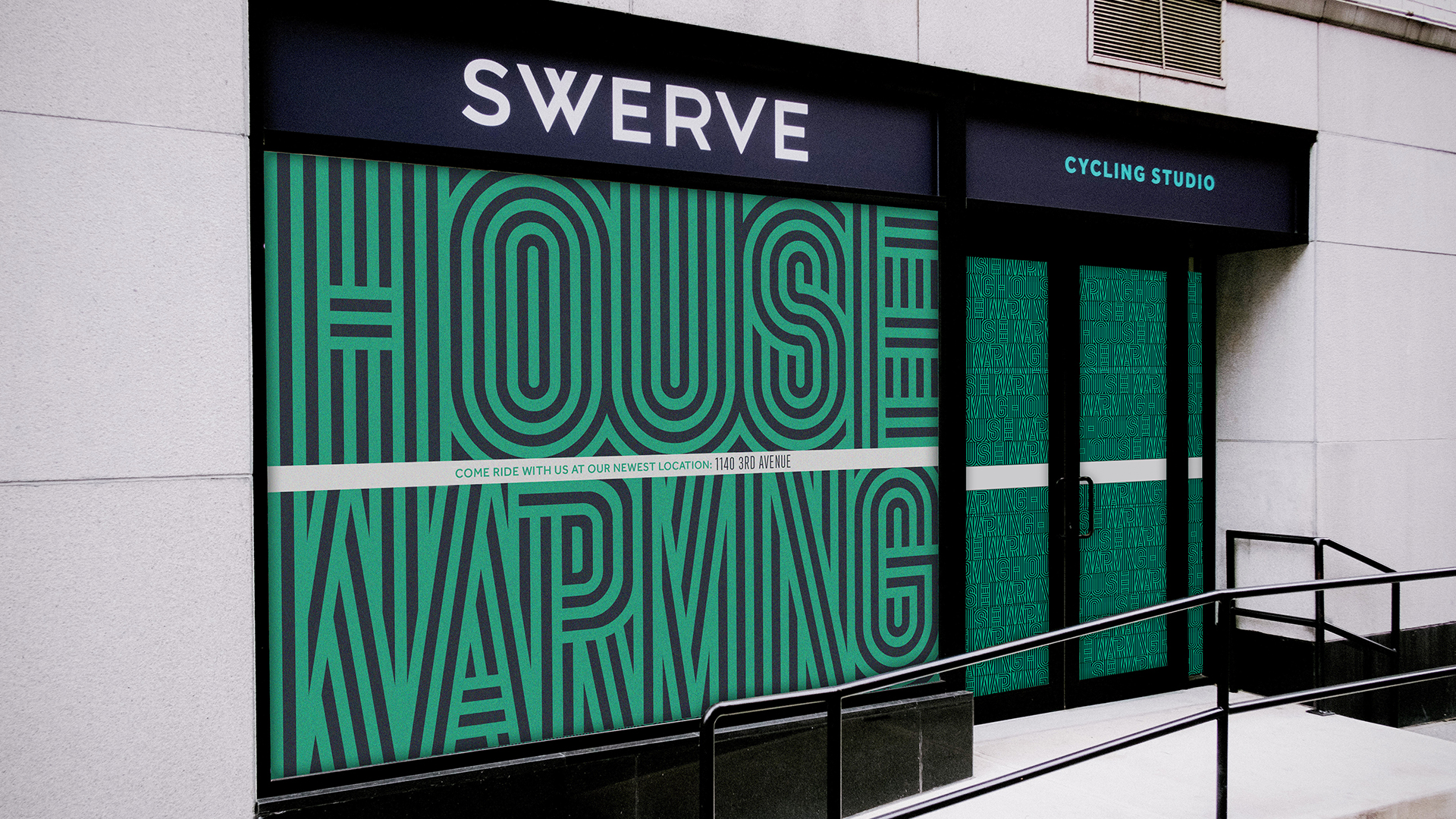
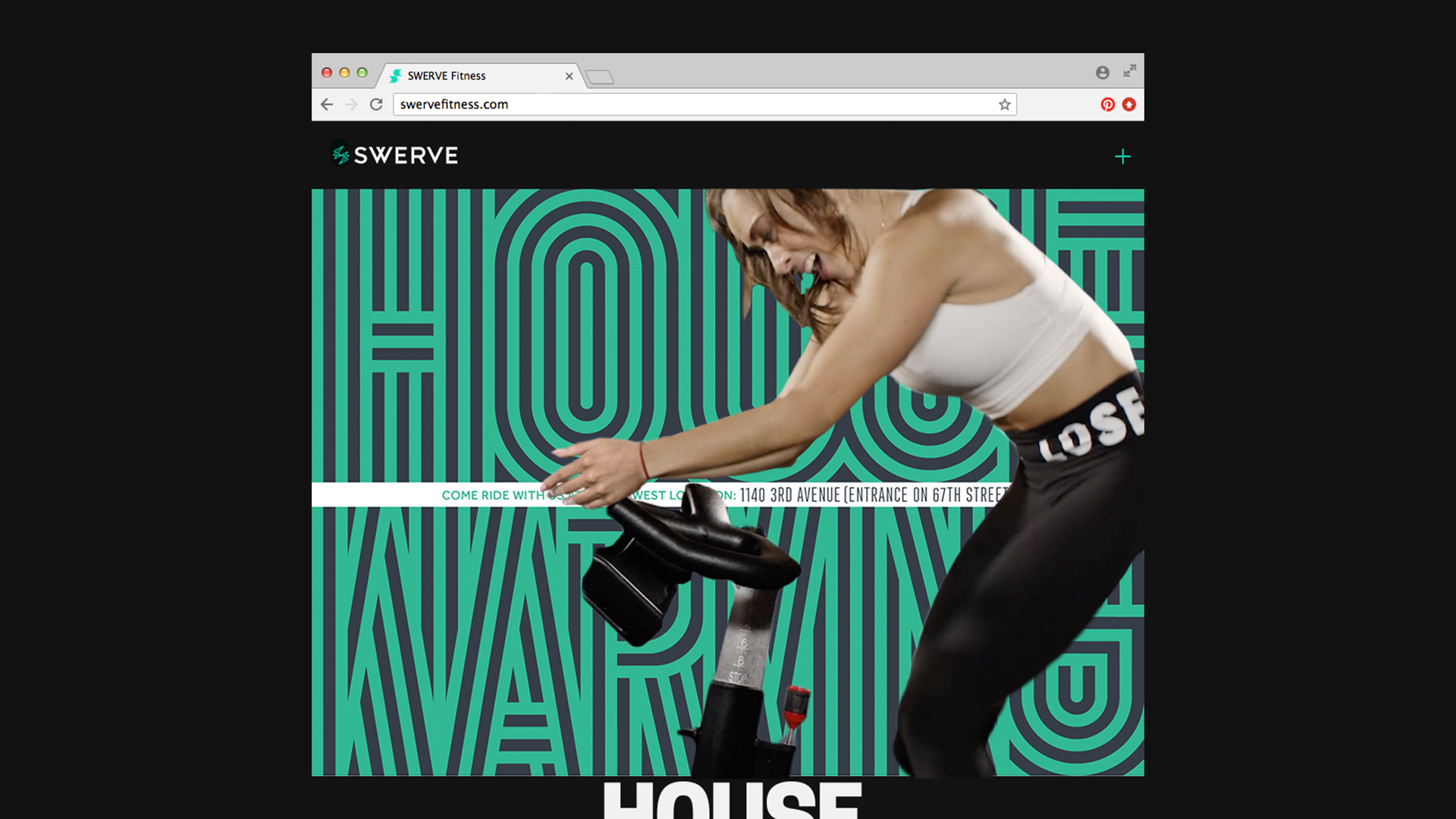
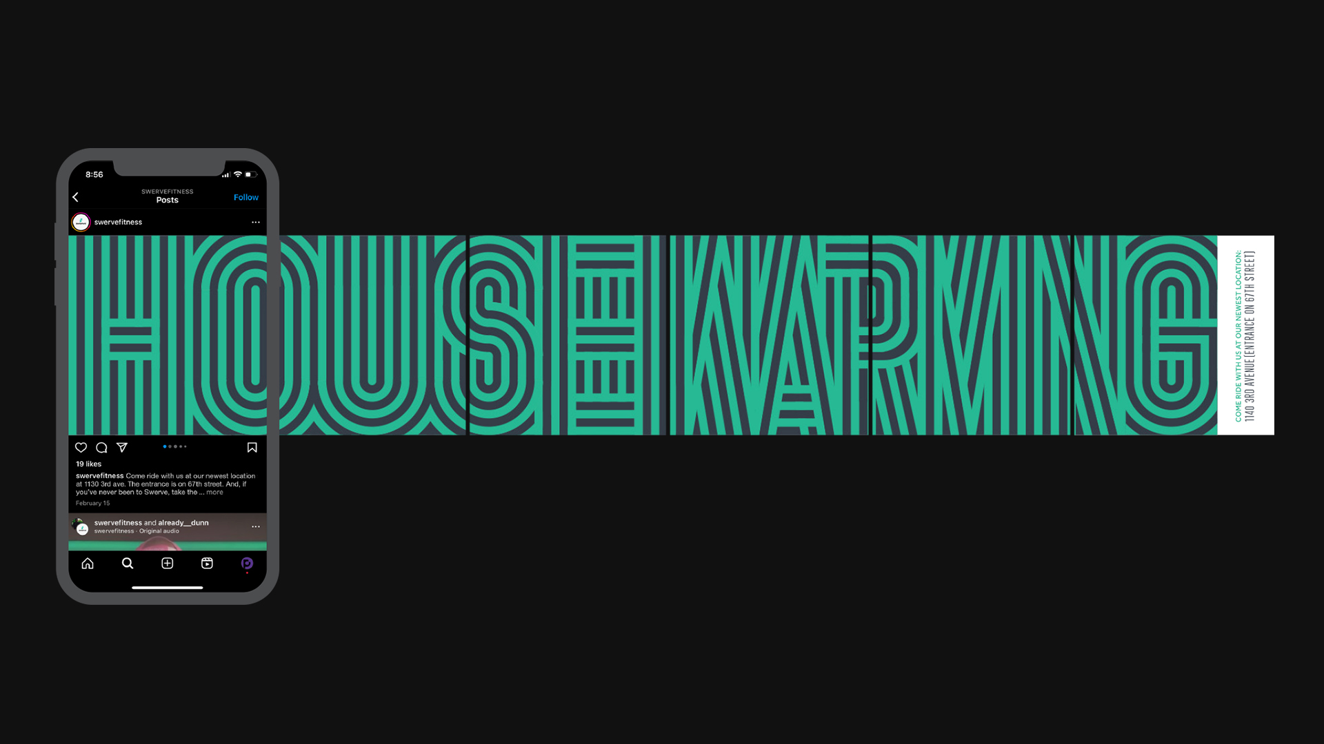
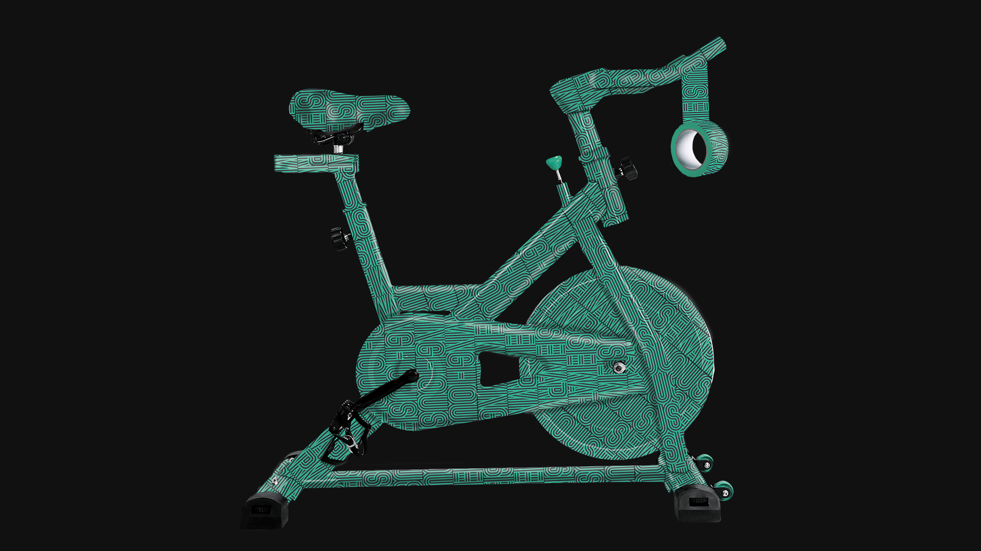
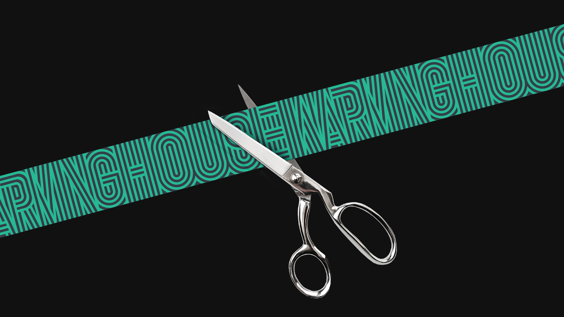
Swerve Fitness, a boutique cycling studio in nyc, needed a mailer invitation to announce the grand opening of their new Upper East Side space.
Inspired by the energy of their group classes, I created a vibrating type treatment designed to grab eyeballs and raise anticipation.



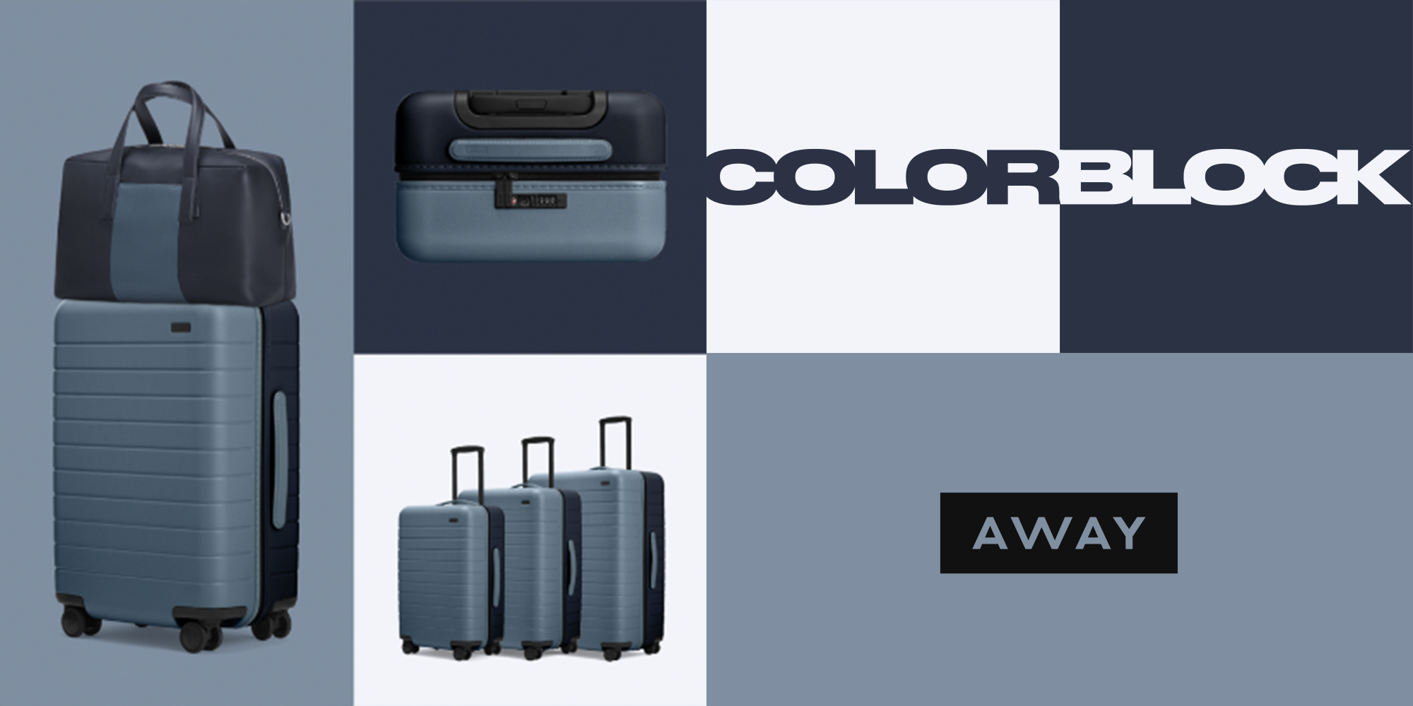
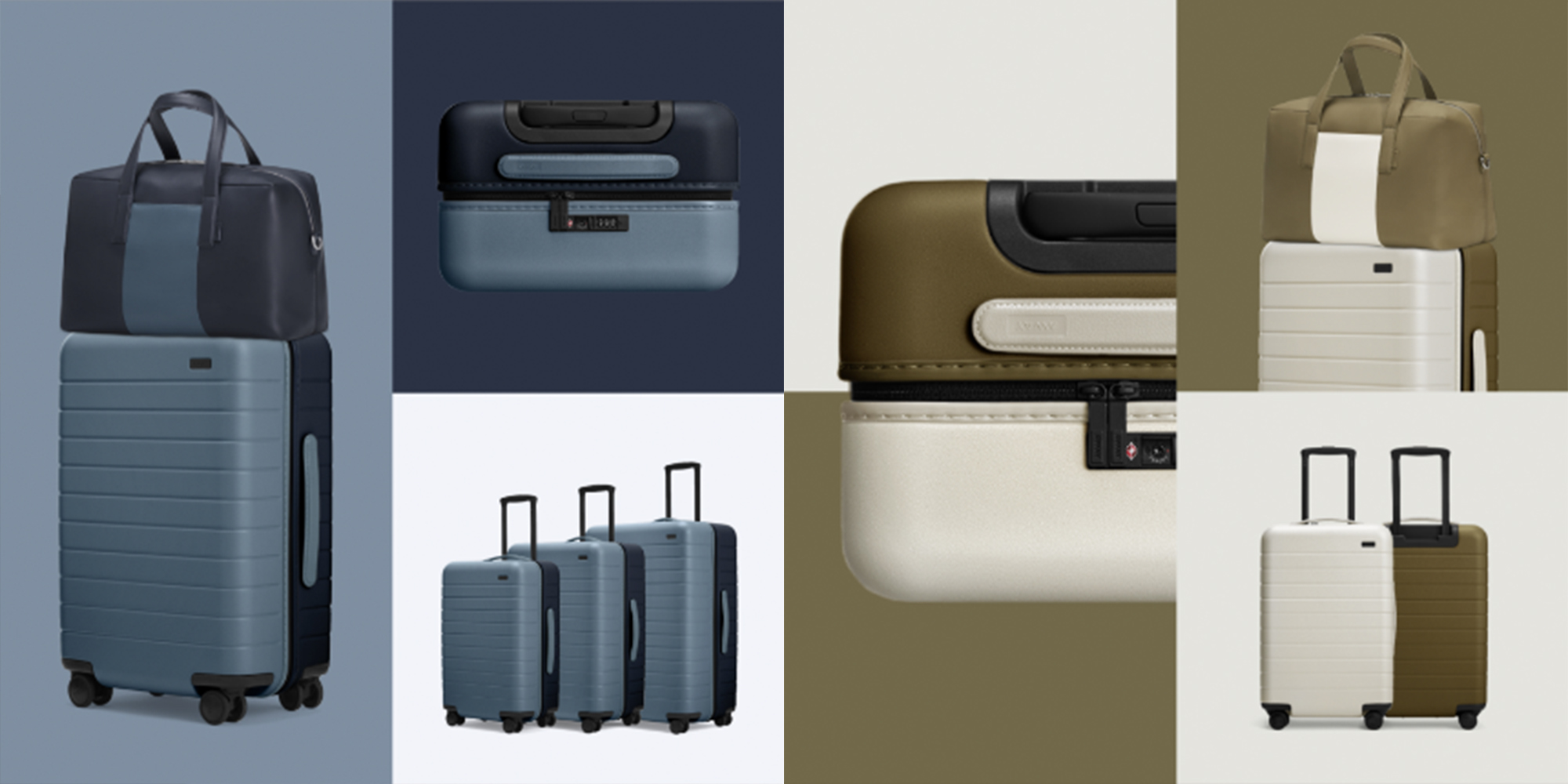
AWAY: COLORBLOCK LAUNCH
Campaign Identity
For a product launch with a tight deadline and no budget, I designed a quick and simple color block system using four simple rules The product’s colors, color blocking, dynamic crops of pdp assets, and always showing both colors of the product.
After establishing the system, I managed all asset creation with two designers to ensure consistency throughout every channel. I also helped designed a lot of the assets to insure an on-time delivery.


SOLIDARNOSC
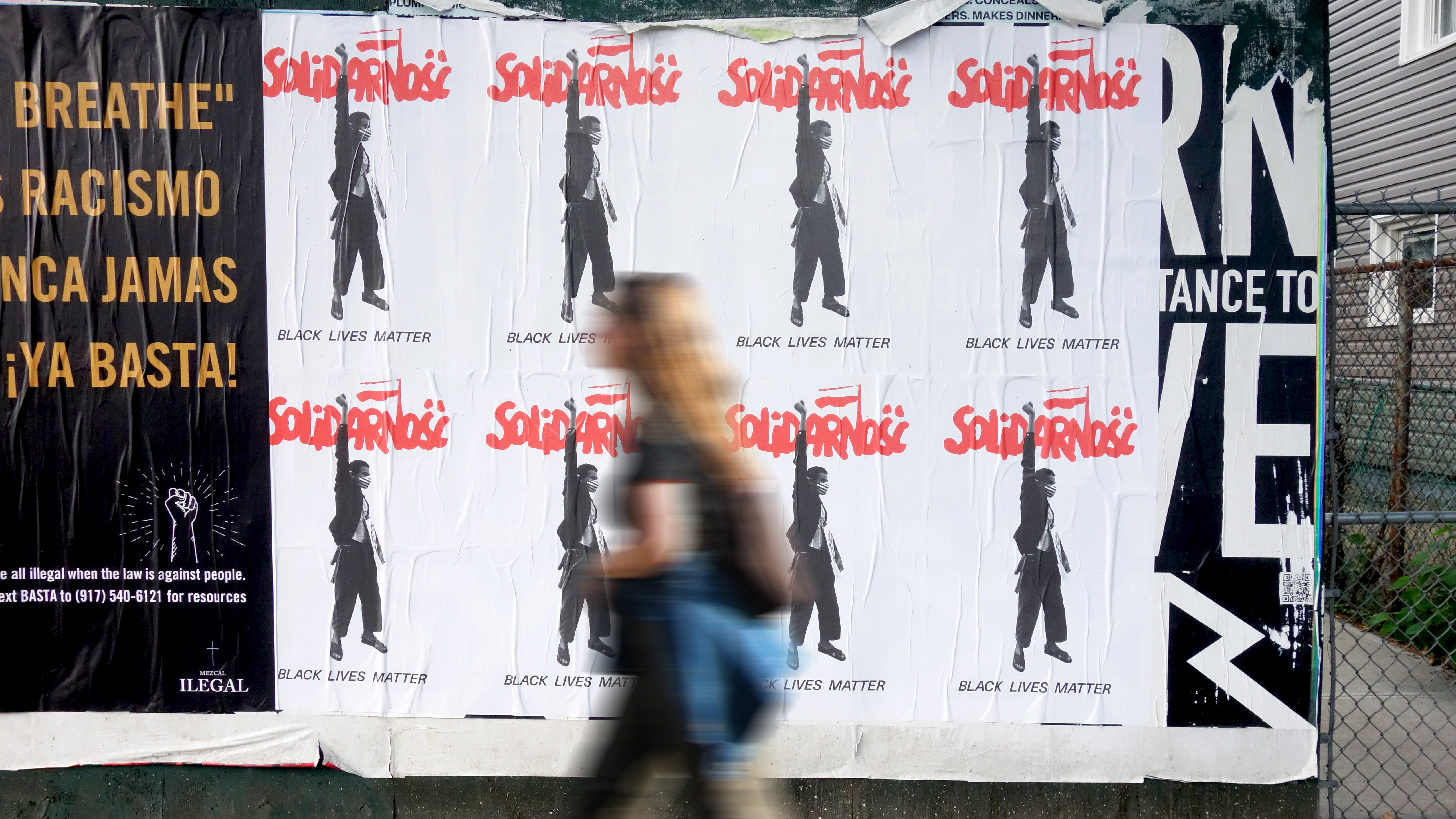
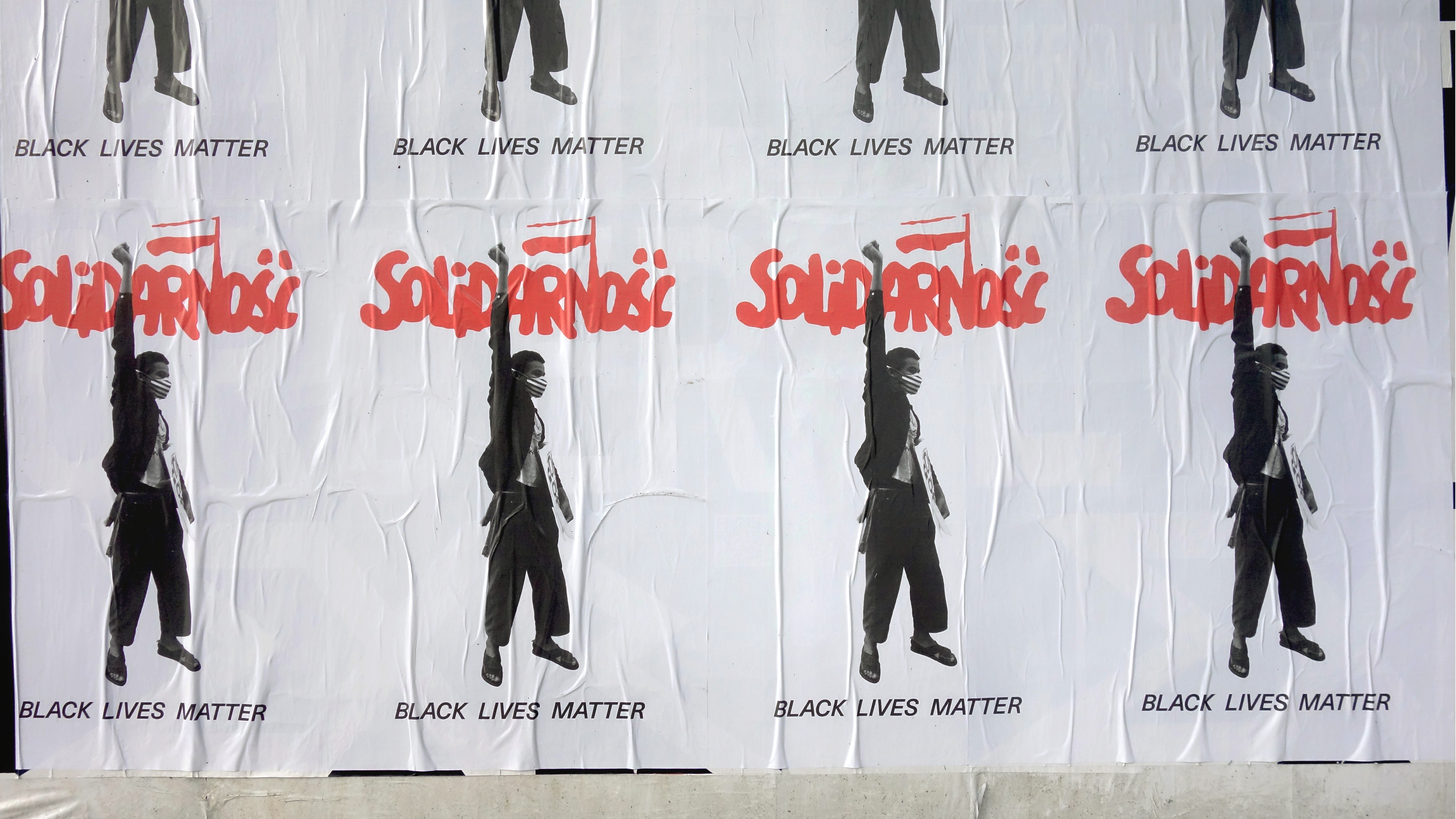
Poster Design
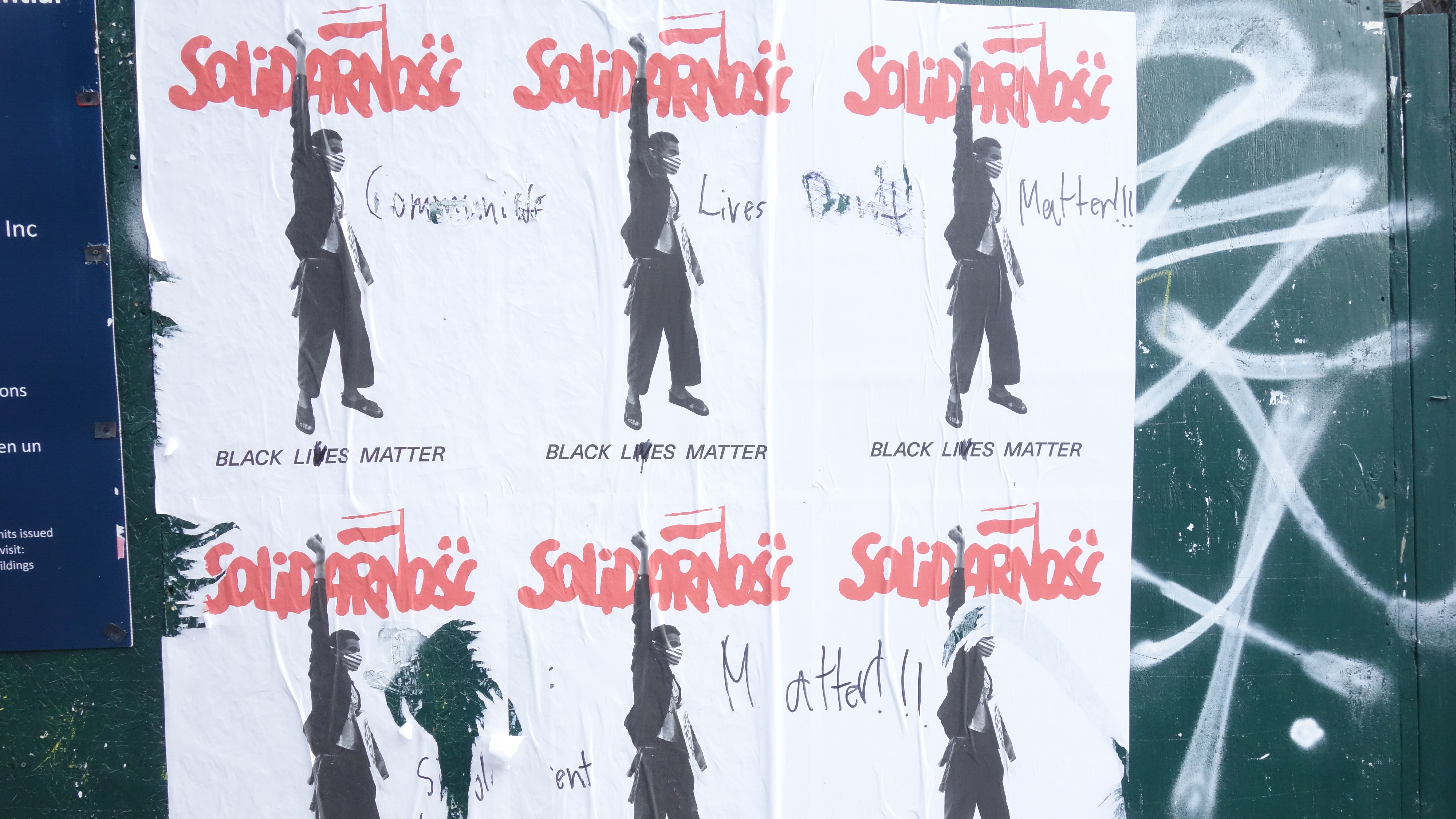
At a time of racial tensions across the US, one of my Polish friends believed a clear sign was needed to rally the Polish community in support of the BLM movement.
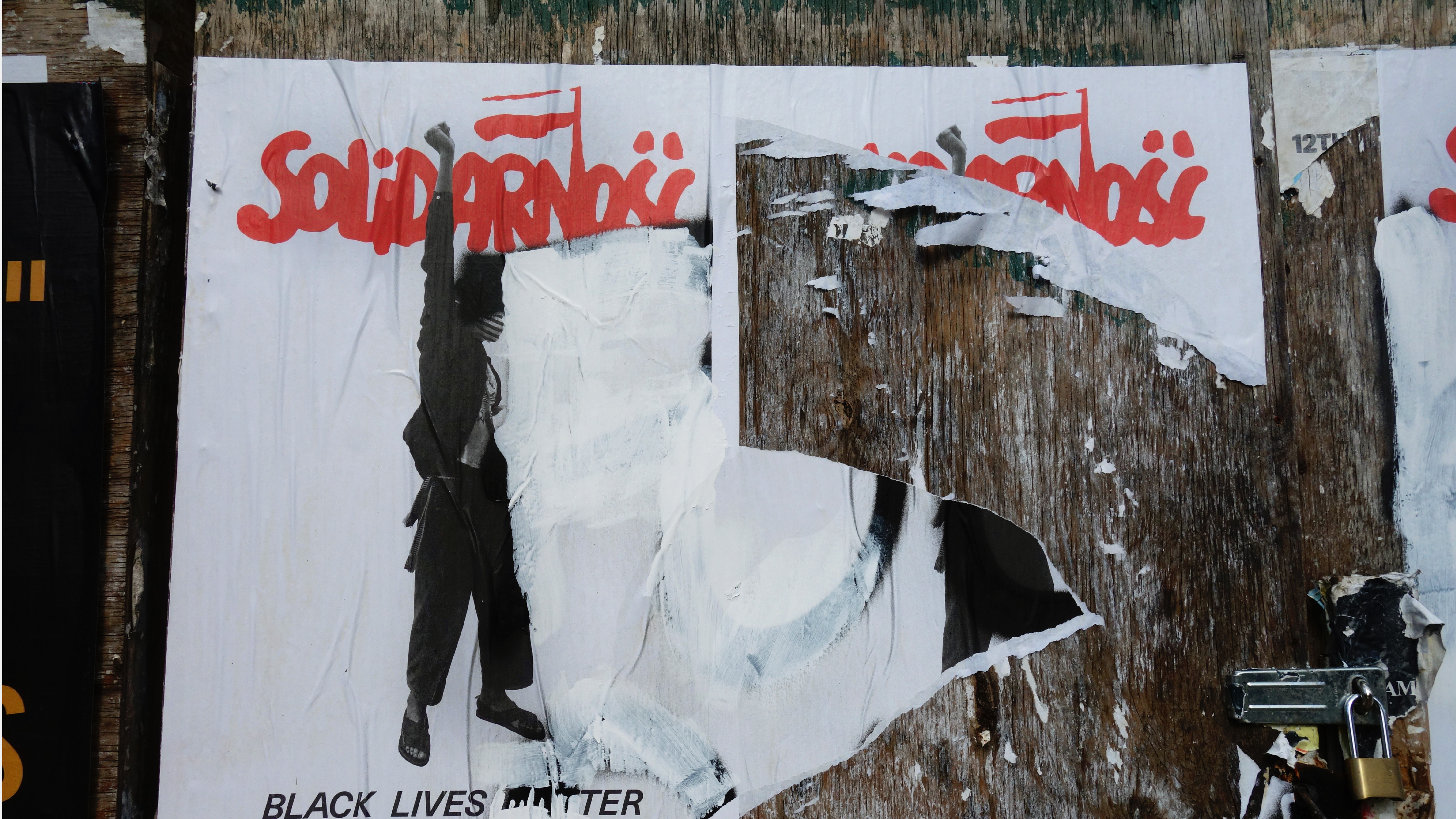
Two Polish creatives tapped me to help them reinterpret a classic Polish social movement poster to remind the Polish community to support BLM and take a stance.
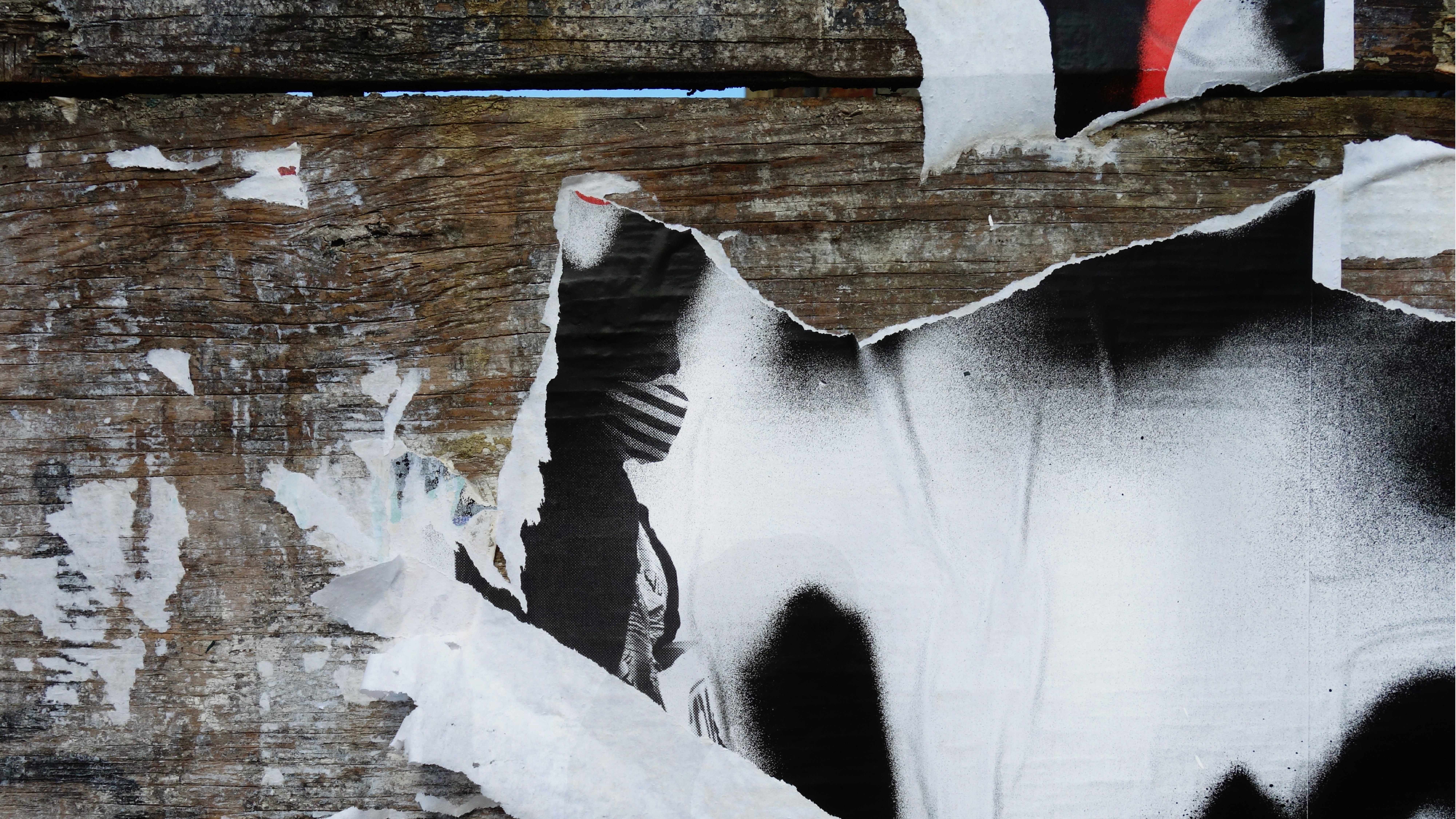
It was then pasted all over Greenpoint, Brooklyn, of the largest Polish communities in NYC, inadvertently creating dialogue between the community through graffiti and tearing
gestures.


DNM BIBLE
Editorial Design
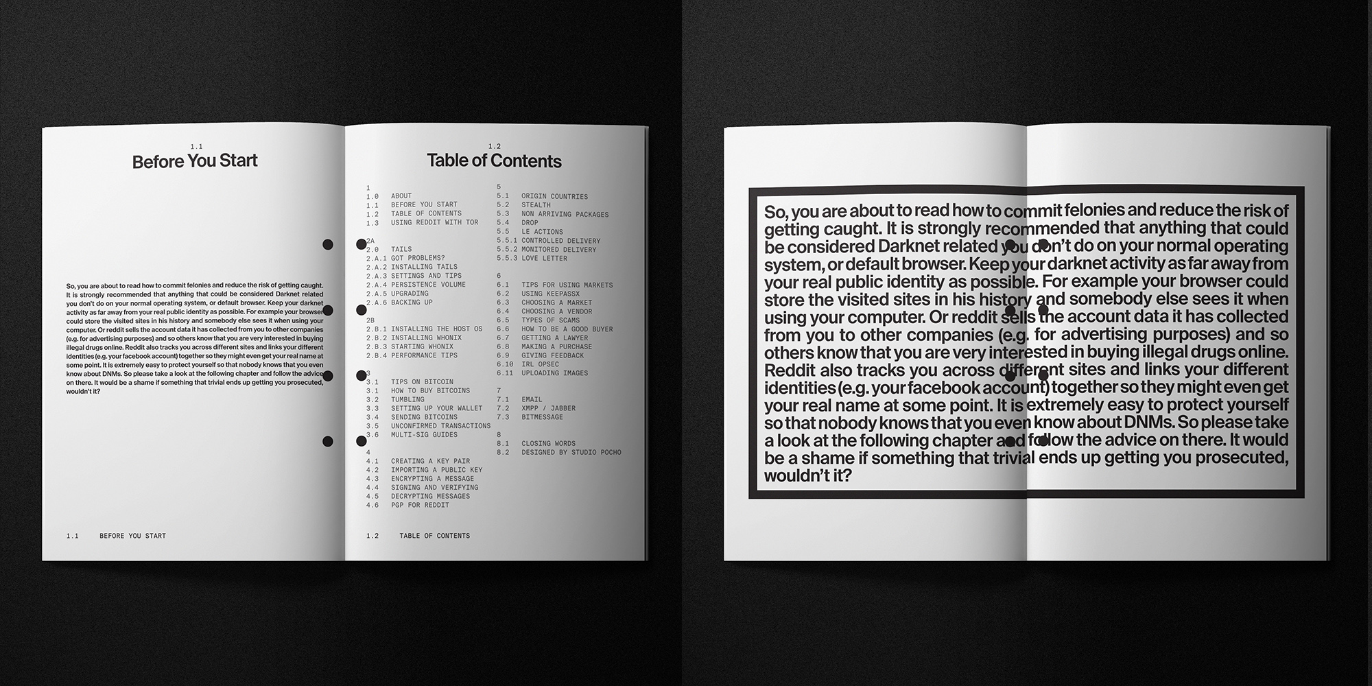
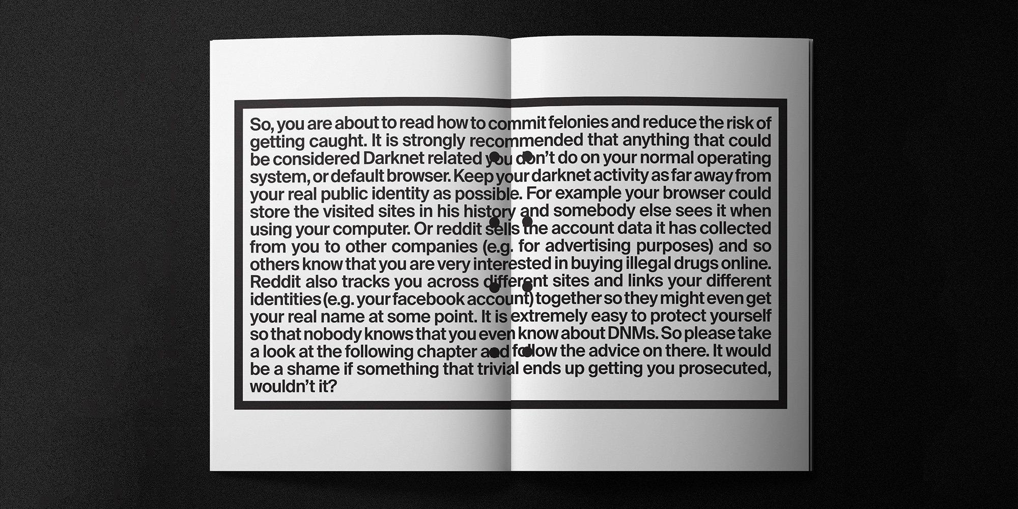
The dark net market basic instruction before leaving earth (better known as the DNM bible) is the required reading document for any noob looking to safely and anonymously explore the deep and dark web.
This fictional design and example spreads, are inspired by the Apollo 11 lunar landing manual; a nod to deep space exploration and instructional graphics.




DREAM MARKET REBRAND
Visual Identity
Dream Market was one of the largest online dark net markets founded in late 2013.
This fictional brand evolution takes from Dream Market's original dna and reimagines the largest darknet market as the largest clear net market in an open society.
The original logo consisted of an unauthorized use of amazon's "smile" icon combined with spirals to create a hypnotized face. This "détournement" approach is applied to the rest of the brand's touch points to create a familiar, "trustworthy," and unified visual identity.
![]()
![]()
![]()
![]()
DREAM MARKET REBRAND
Visual Identity
Dream Market was one of the largest online dark net markets founded in late 2013.
Visual Identity
Dream Market was one of the largest online dark net markets founded in late 2013.
This fictional brand evolution takes from Dream Market's original dna and reimagines the largest darknet market as the largest clear net market in an open society.
The original logo consisted of an unauthorized use of amazon's "smile" icon combined with spirals to create a hypnotized face. This "détournement" approach is applied to the rest of the brand's touch points to create a familiar, "trustworthy," and unified visual identity.


DARKNET MERCH
Product Graphics
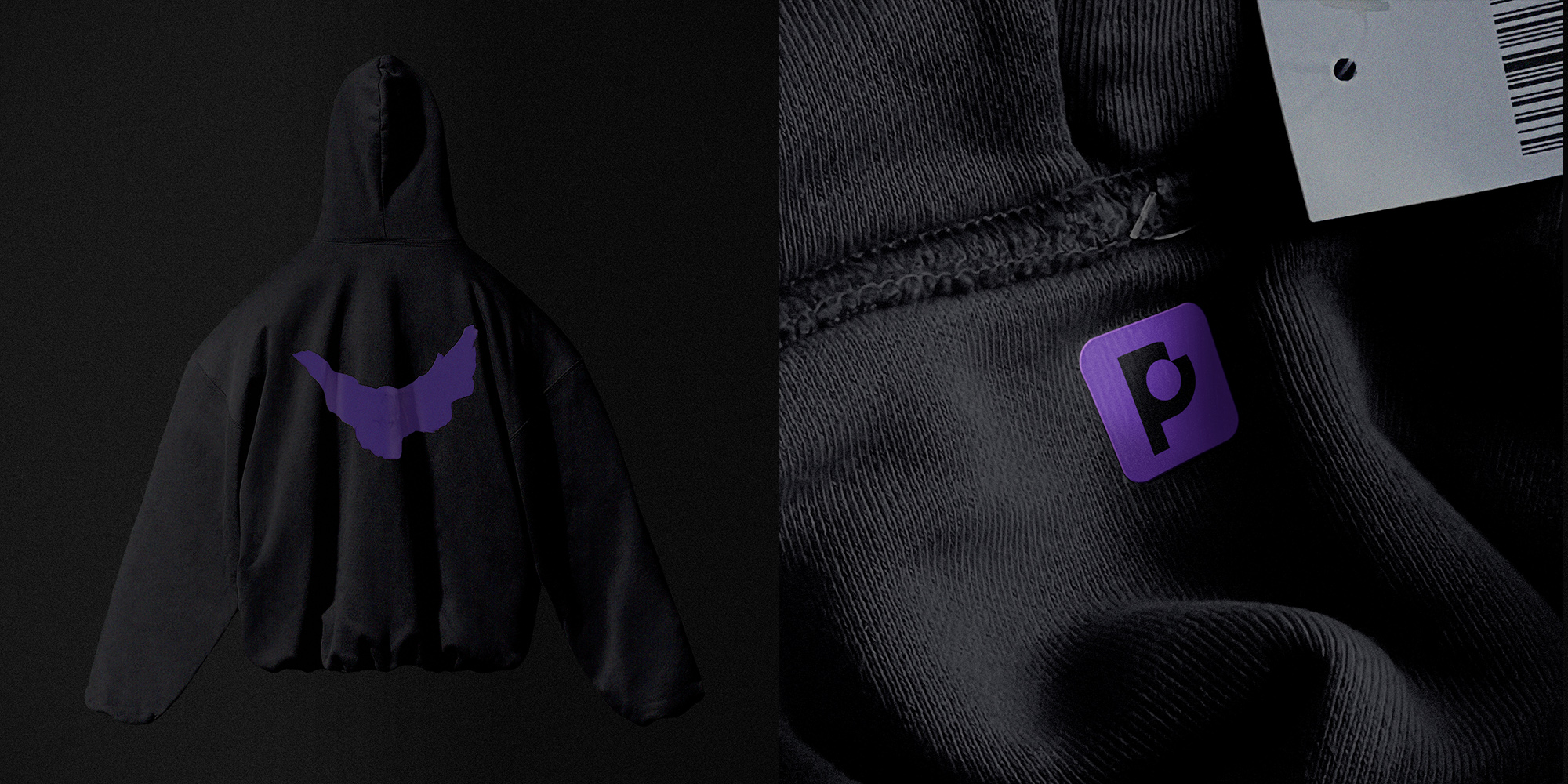
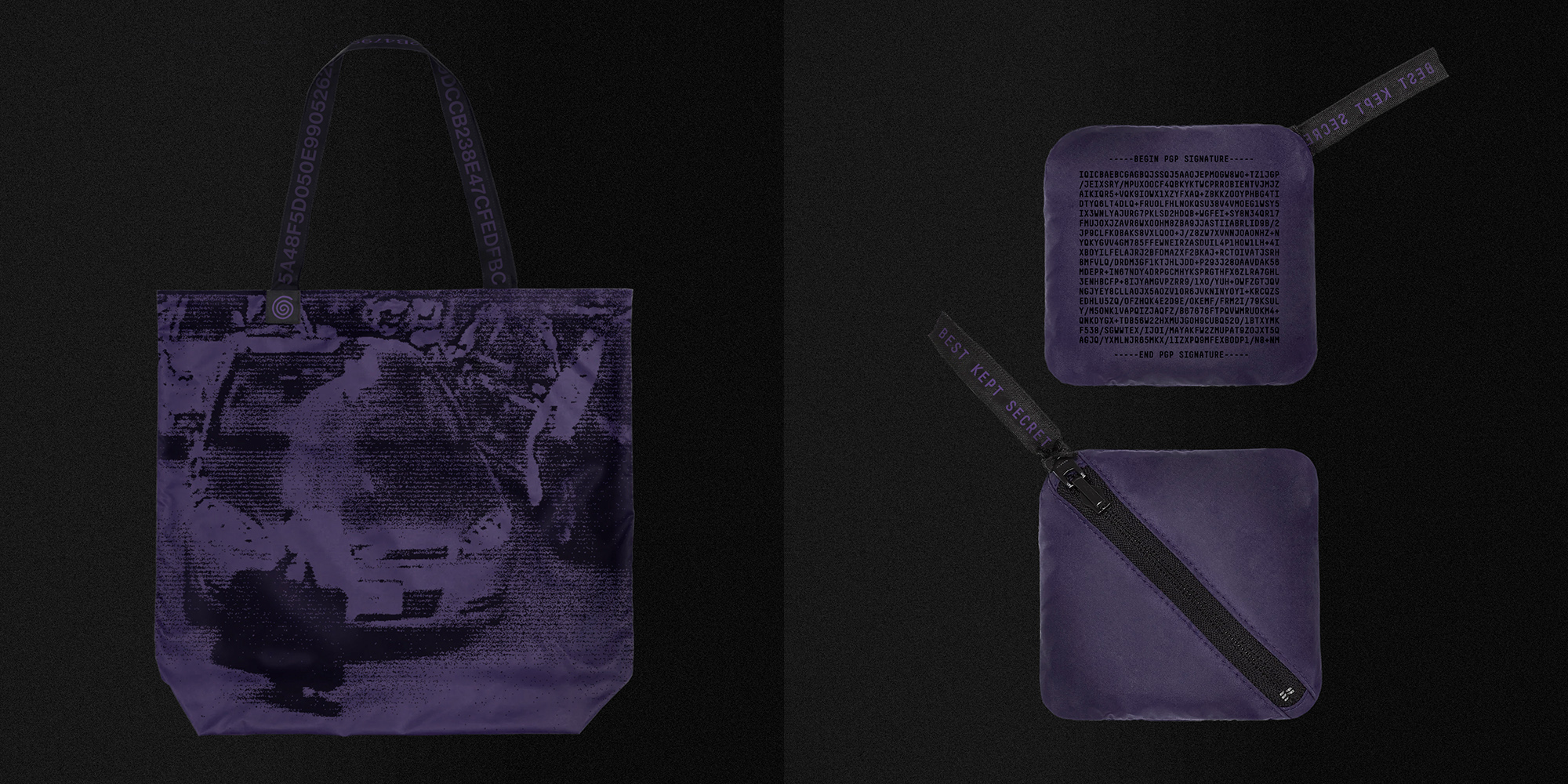
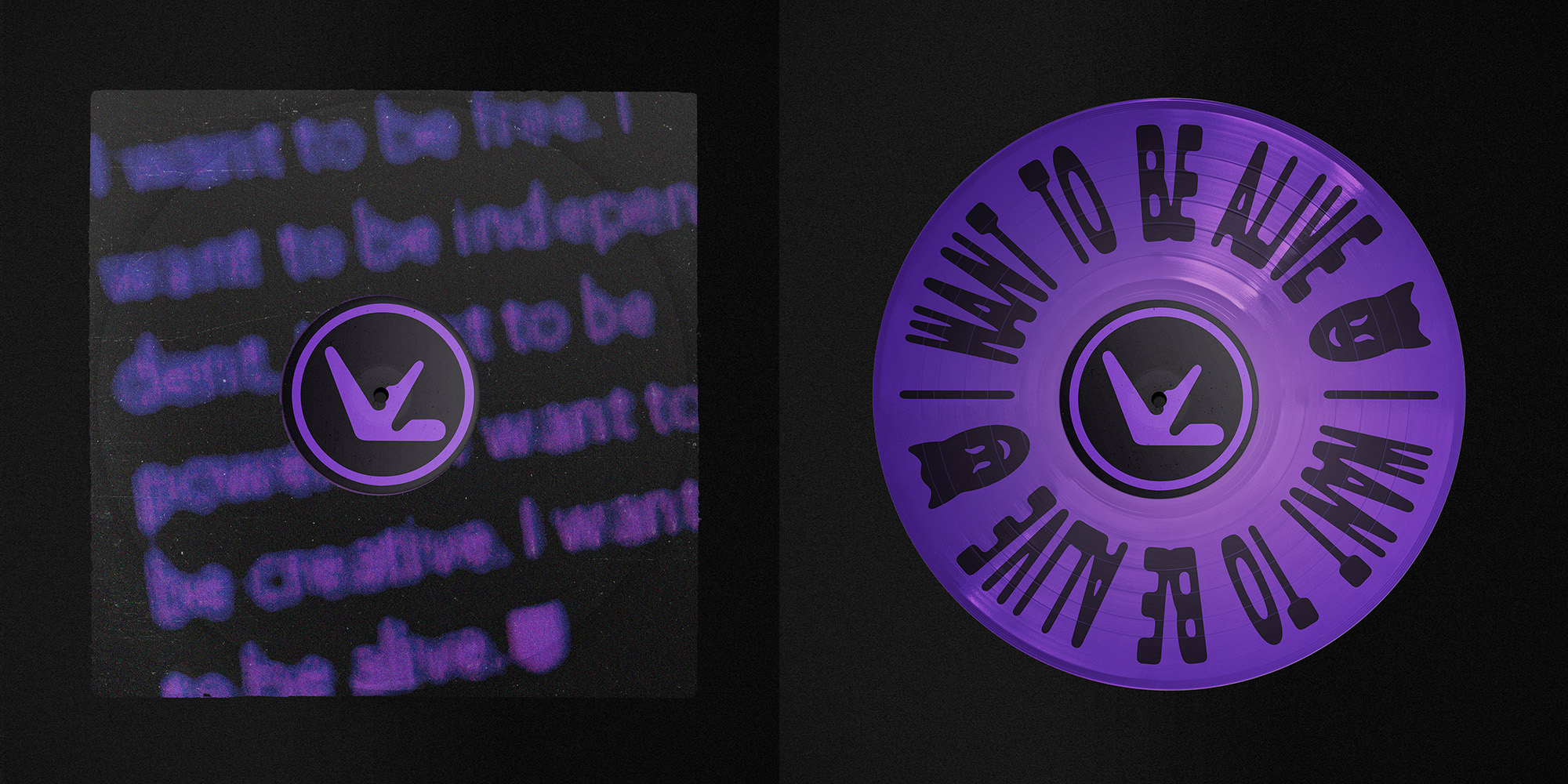
An ongoing series of merch inspired by various aspects of the dark web.
From the term FUD (fear, uncertainty, and doubt) to bagman tote bags inspired by disgraced secret service agents to Aphex Twin’s dark web persona (user18081971)...
Each mysterious object is rich with background story to anyone who wants to dive in deeper.
![]()
![]()
![]()
![]()
![]()
DARKNET MERCH
Product Graphics
Product Graphics
An ongoing series of merch inspired by various aspects of the dark web.
From the term FUD (fear, uncertainty, and doubt) to bagman tote bags inspired by disgraced secret service agents to Aphex Twin’s dark web persona (user18081971)...
Each mysterious object is rich with background story to anyone who wants to dive in deeper.


SPORTI FITNESS
Visual Identity, Launch Campaign
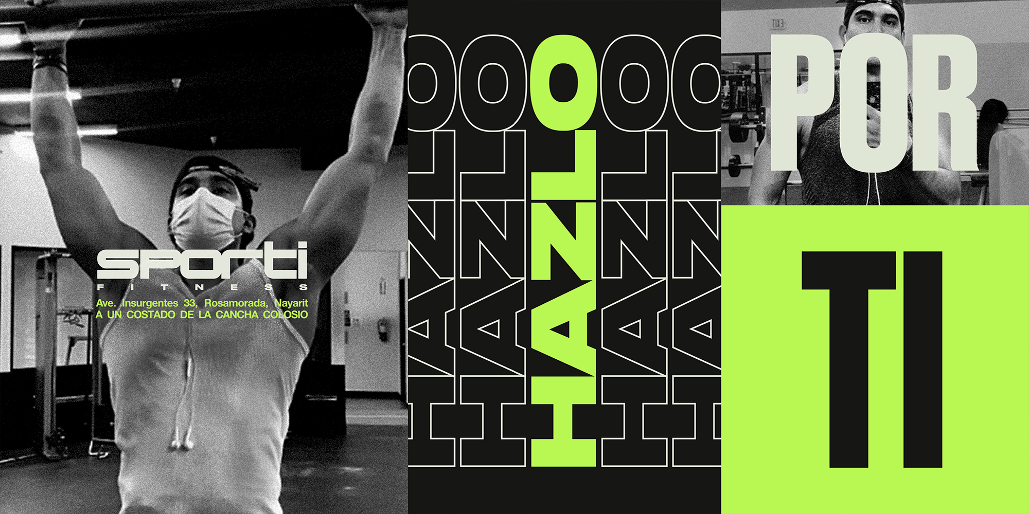
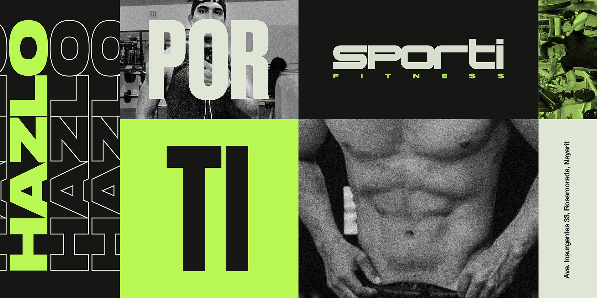
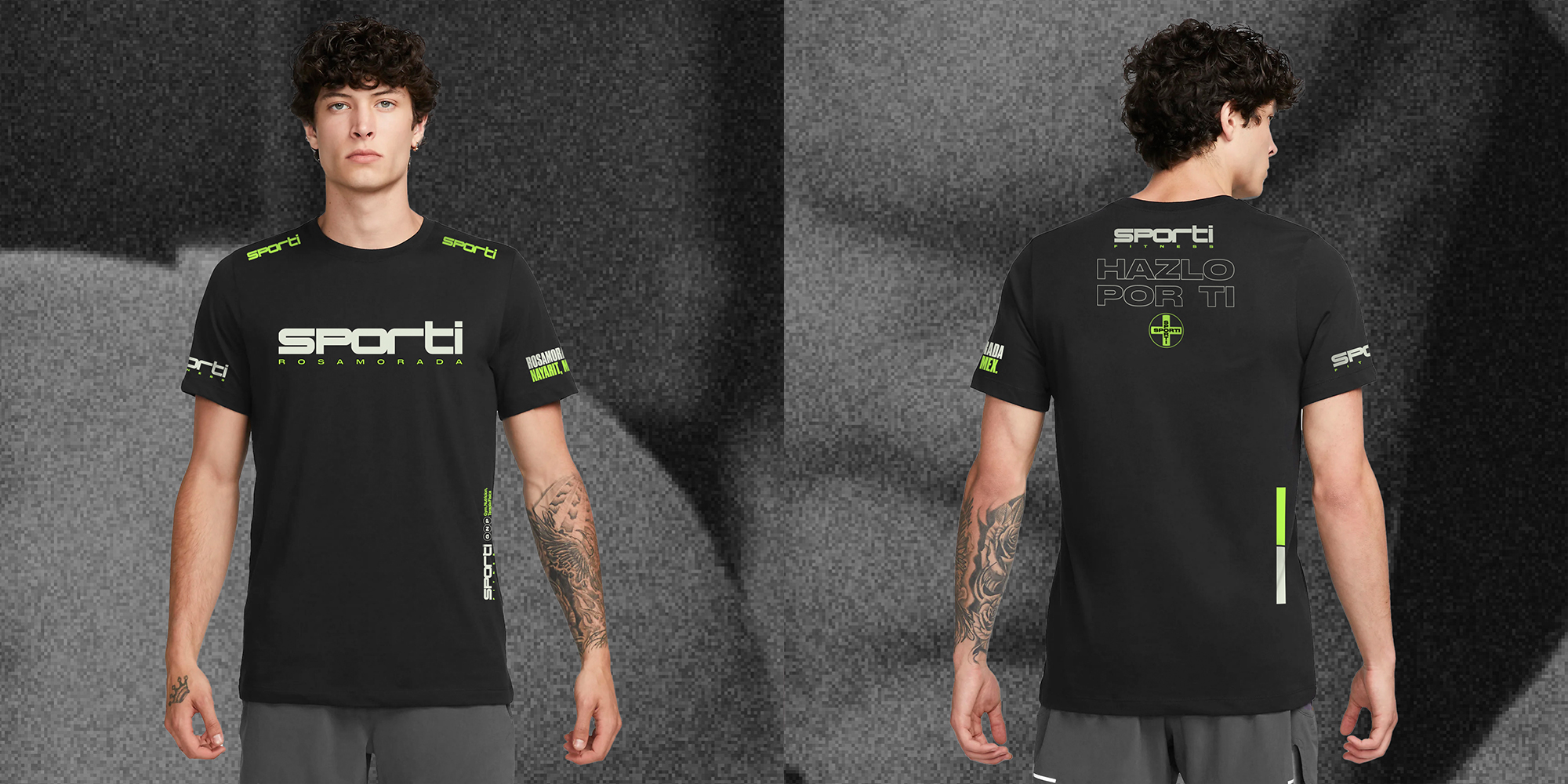
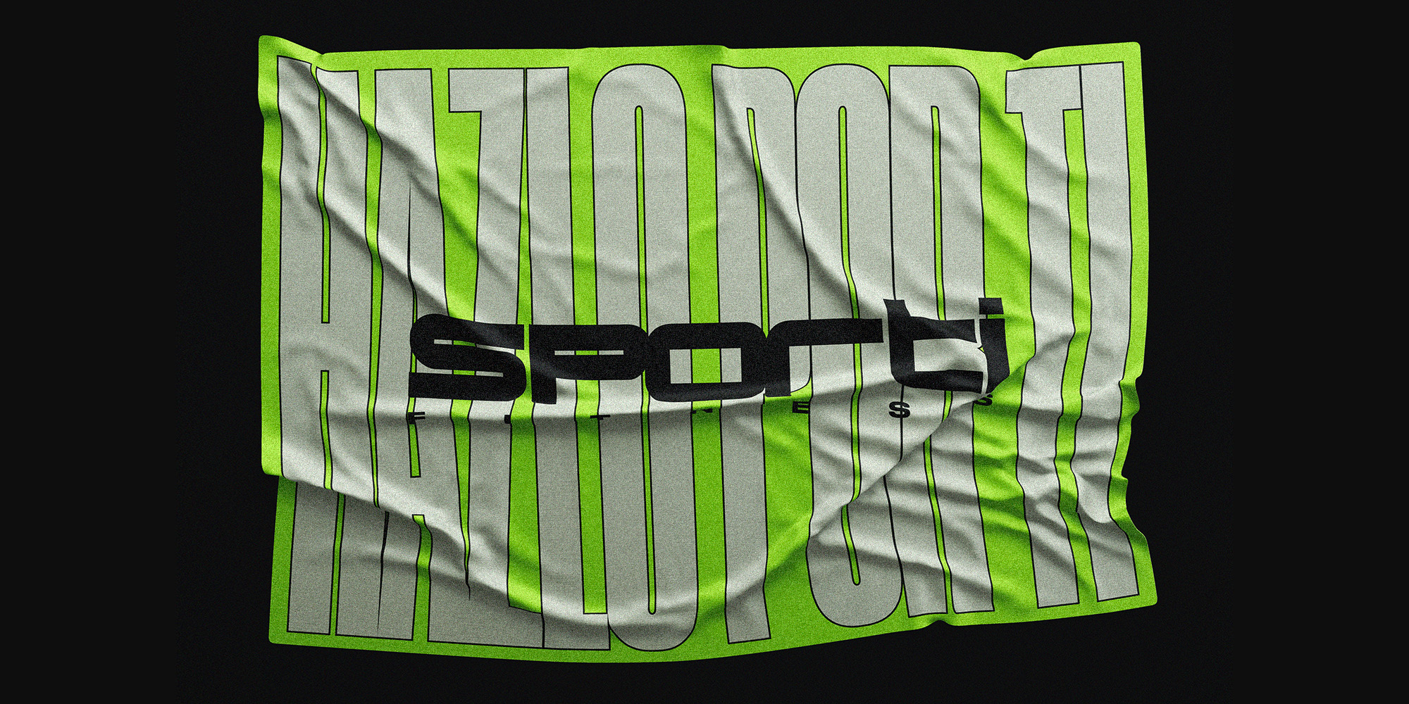
Visual identity and branding for a gym in Nayarit, Mexico. Based around their audience of young, narcissistic, and fit adults, we combined the visual language of 90s sportswear with the repetitive techniques of fitness.
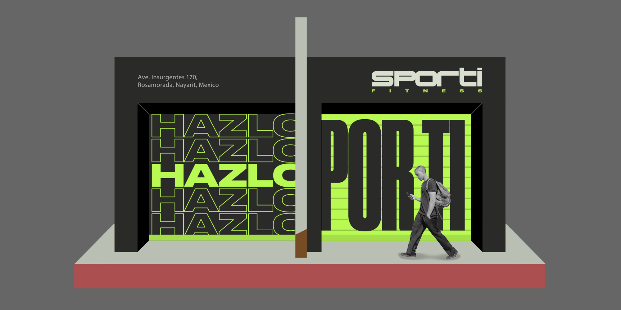
The identity is carried out through social, and other owned channels such as storefront murals, uniforms, and gym swag.
Leading up to the gym opening we rolled out tagline “Hazlo Por Ti,” a play on the brand’s name “Sporti” meaning “Do It for You” on social and storefront mural.
DÉTOURMENT: GRAFFITI STICKER
Typographic Label Design
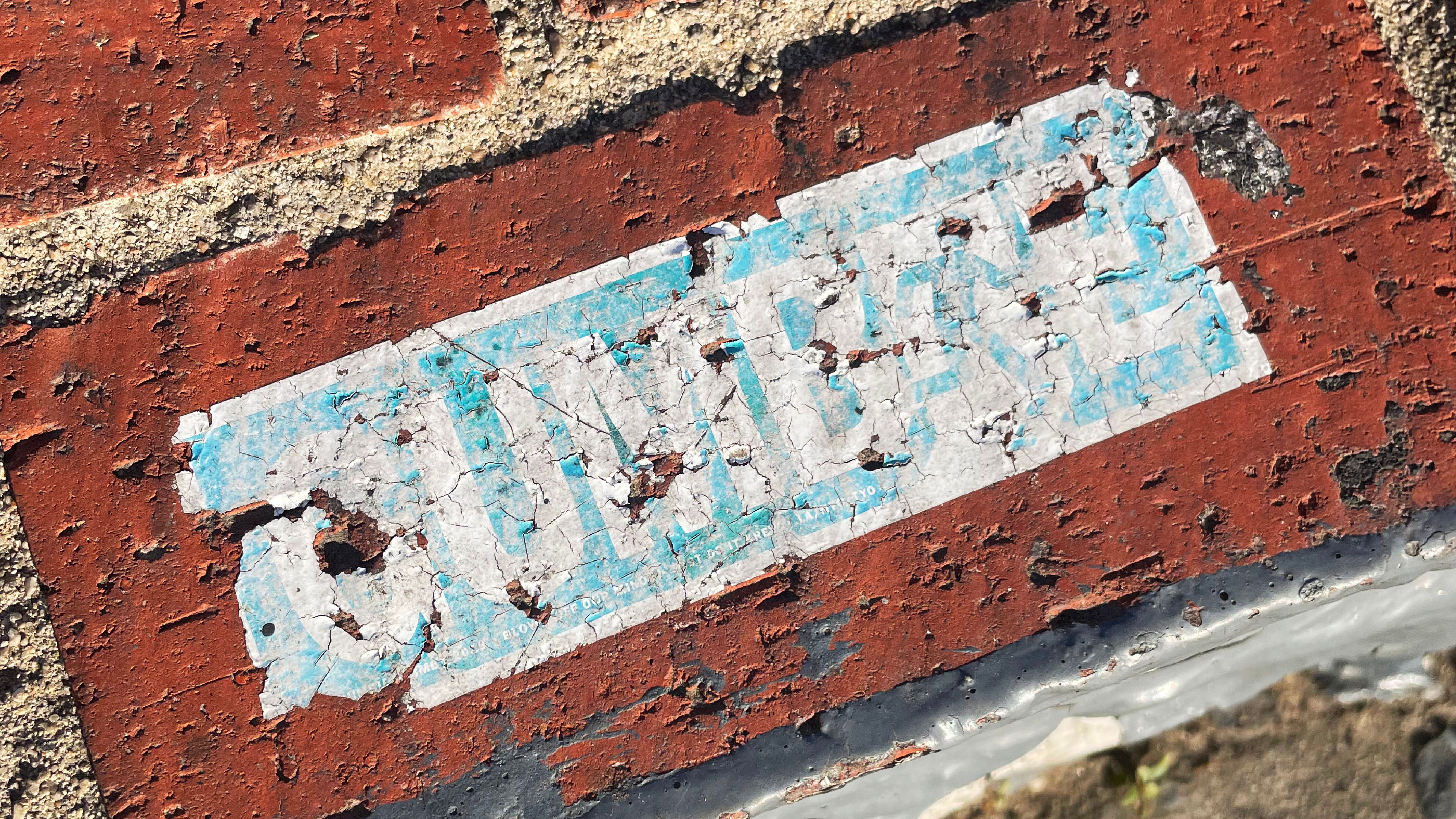
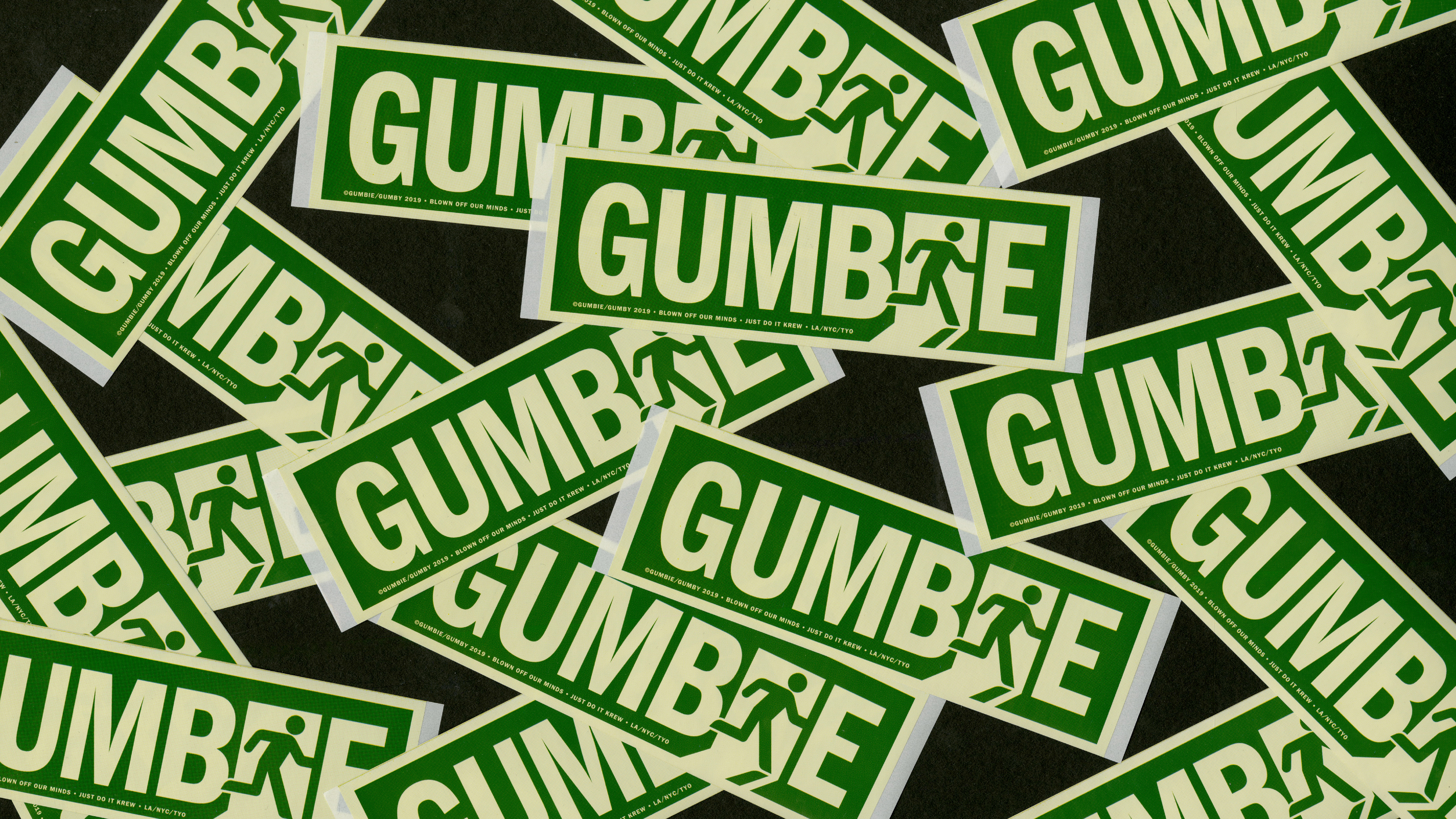
For my personal graffiti moniker of “Gumbie,” I wanted to create a sticker that blended in with it’s environment to ensure its longevity(and avoid being taken down).
I developed a series of designs under the technique of “détourment,” reclaiming vernacular signage found on the streets for the sake of graffiti.


“FAMILIA” FAMILY REUNION SHIRT
T-shirt Graphic
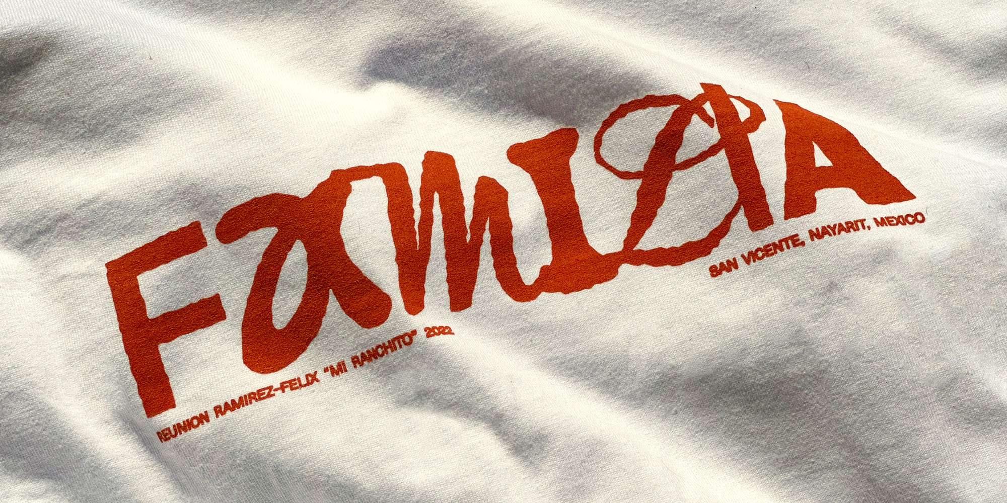
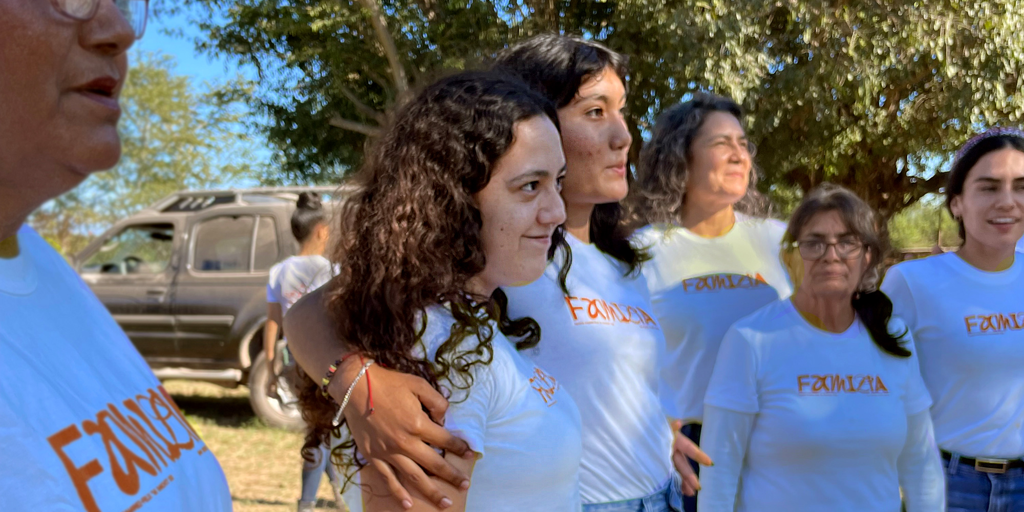
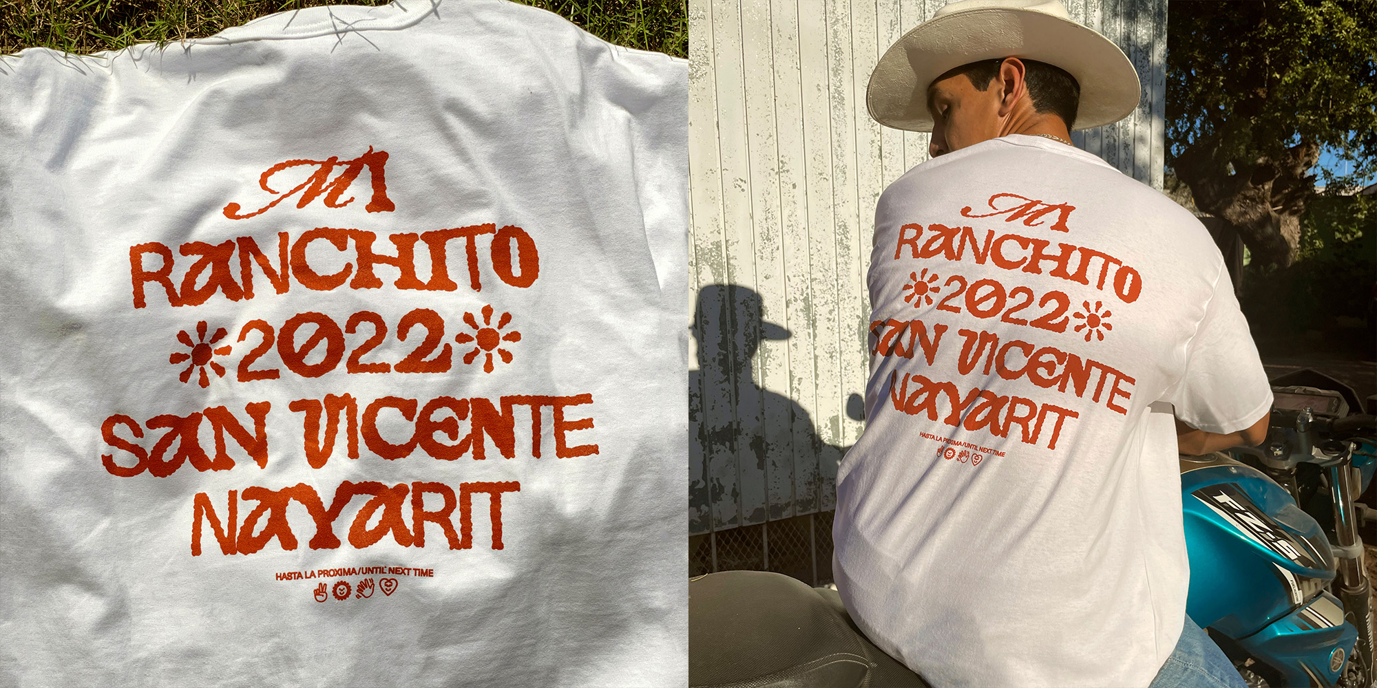
For our annual family reunion on our great-grandfather’s ranch, I created a t-shirt with the word “Familia” set in a variety of different fonts to represent our family members coming together from different walks of life. The word was then rendered to resemble dirt, a nod to the mother land and our family’s ranch.
